The final face of my site after the CSS has been applied is almost identical to my design flat. The differences lie within some of the proportions of the body and positioning of some elements in the header. I feel that the final layout is much better then the flat as it fits and displays everything to suit the information more realistically.
For example, there is a lot more information contained within the home page now, then there was when it was a design flat. Also, the navigation pane took up the whole right hand side of the site, but after coding that proved to be impractical and unnecessary. So it is now much shorter and straight forward.
One error I came across was trying to get the main-content's background image to just stretch (without messing up the proportions) to match the entire length of the site. However, after much trial an error I found that the repetition in the background worked well for the site and decided to stick with it.
Another difficulty was the learning curve that is W3C testing. After spending too long fixing up my HTML I learned a lot more about the structure of HTML code and how it works in relation to other sections of code.
All in all I am pretty happy with my site. It is exactly what I set it out to be, a simple HTML site that is pleasant to look at and easy to navigate through. I think if I had more time (and less other assignments) then it might have turned out a little more professional looking, with more refined features. Though having said that, it is still what I aimed for.
I feel that I have learned a lot about HTML and CSS coding, enough at least to move onto coding my personal site confidently.
Monday, May 2, 2011
Sunday, March 13, 2011
Rationales for various aspects of the design
Head Style and Size:
The header is the very first part of a site that is viewed. It is the heart of any site and must reflect the site’s content and come across as user friendly and appealing. For myself, this is the most interesting and rewarding part of any site to design, and so gets most of my attention during the designing process. The header must contain the main colours and patterns that will be found throughout the site. I started by choosing a backdrop colour, I chose a dark grey because I felt that this aspect of the site needed to be subtle enough to bring out the pattern that would go over the top. Next, it was time to decide on a pattern, this part of the design came to me by chance. I was just mucking around with shapes and accidently made the pattern I have now. It was simple yet inviting, perfect. I then expanded and adapted it.
When it came to the logo I knew what I wanted to achieve. It was just a matter of choosing a colour and font that would suit everything else. I chose the colour as a subtle ‘non-grey’; as, if everything was grey it would be a very boring site. If you wondering ‘why so much grey’, well that is because I have noticed a trend appearing amongst design sites and that’s dull colours. It really brings out any other colour used in the logo or anything else used to identify the company. Contrast is a powerful tool.
This header really came about by playing around with illustrator, not so much by research. I did however have a brief looks at sites before designing this which may have had a subconscious affect on my design, particularly this site.

It is a site that contains a couple of simple patterned headers with large dimensions and minimal graphics.See below for URL.
Christian Graphic Design, Templates for ChurchEdit.com, http://www.andrewkelsall.com/christiangraphicdesign/christian-web-design-templates, Date Accessed; 14/3/11
Number of columns and widths:
The homepage only has one body column. This is because it is an introduction to the site and should be grand and singular. The other pages will mostly have two columns, and for a page with lots of links three columns. (This is not including the navigation pane as a column and instead counting it as its own aspect).
The widths of columns is simple in this design, an even spread is best for one and two columns. As previously mentioned if there is a lot of links then three columns may be appropriate, in this case the third column of links would be significantly narrower than the other two columns.
It would look something like this site, which gave me my ideas for column dimensions.

This may not exactly be a site devoted to the topic at hand, but the images here helped with my initial research.
In terms of the functional columns to align the whole site I went with the 960 grid system and chose a 16 column grid. See below for URL.
In terms of the functional columns to align the whole site I went with the 960 grid system and chose a 16 column grid. See below for URL.
Web design and web designers, top then sites where to find wordpress themes, http://www.pickysite.com/blog/wordpress/322/top-10-sites-where-to-find-wordpress-themes.html, picky site 2010, Date Acessed; 14/3/11
Background Style:
For the body image I wanted something simple that reflected the header pattern without being over the top of detracting from the body text. I found a site that contained examples of site backgrounds which contained a pattern I found particularly appealing.

Although this picture is obviously much more built up with effects and detail, one can see my body text backdrop if one tried to convert that image into a much more simplified version.
I chose the colour simply to tie in with the header and not get lost into the background colour, all the while not detracting from the body text.
See below for URL.
BlogPixelThemes, Underwater Dreams Lighting, http://blog.pixelthemes.com/freebies/16-free-collection-of-lighting-background-or-light-effects-very-useful-for-presentations-or-website-backgrounds, Pixel Themes 2011, Date Accessed; 14/3/11
Main navigation style, size and position:
In terms of main navigation I went for a simple approach. White text that stands out over the header’s otherwise simple grey appearance. Capitals were a choice I made because it stands out more and attracts the viewer’s attentions quicker. Also the horizontal navigation layout contained within the header, for the same reason as the capitals. I took a screen shot from a site that provided some inspiration in this matter.
In terms of main navigation I went for a simple approach. White text that stands out over the header’s otherwise simple grey appearance. Capitals were a choice I made because it stands out more and attracts the viewer’s attentions quicker. Also the horizontal navigation layout contained within the header, for the same reason as the capitals. I took a screen shot from a site that provided some inspiration in this matter.

This is an interestingly simple site, though my focus was on the main navigation bar there were other aspects to this site that caught my attention. I feel that this site really captured the elegant simplicity of a good navigation pane, something I feel I might have recreated in my own design.
See below for URL.
Search field:
I have always appreciated the classic search field. Something about that white, curved, rectangular box is nostalgic. I chose to keep it simple, besides personal preference, it is always horribly frustrating to have a complex or hard to find search bar. I went in search of some inspiration to match my idea I already had. Although I stuck with my own ‘classic’ version of a search field, this example was a good help.

It is both simple and straight to the point. ‘I’m looking for…’ brilliant. I felt that the grey wouldn’t however stand out enough on my header, hence why I chose white. I also chose the position because generally search fields are found in the top right-hand corner of a site and moving it around might just confuse some users.
See below for URL.
Line 25, How to enhance your form input fields with jQuery, http://line25.com/tutorials/how-to-enhance-your-form-input-fields-with-jquery, Date accessed; 14/3/11
Body text:
The content for the body text was taken from the actual FAD page, using the first section the user comes across. The Dean’s welcome.
The content for the body text was taken from the actual FAD page, using the first section the user comes across. The Dean’s welcome.

The font itself took a bit of deciding. Initially it was Myriad pro, then I went through many different fonts to pick one that matched up to the sub navigation pane to some extent without being the same typeface. Eventually I decided to go to Arial as it is ‘web safe’ and a significantly better option didn’t come to my attention. The size of the font was chosen purely through readability at different sizes. 12pt is perfectly readable without being too big, this decision was also partially influenced by advice from one of my tutors in the past, who told me that websites generally don’t need text larger then 12pt depending on typeface.
See below for URL.
University of Canberra, Faculties, Arts and Design, Dean’s Welcome, http://www.canberra.edu.au/faculties/arts-design, University of Canberra 2008, last updated March 11 2010, Date Accessed; 14/3/11
This site saved my body text, this is what informed me of the web safe issues.
Freelance Switch, Forums latest discussion, http://forum.freelanceswitch.com/topic.php?id=5641, Date accessed; 14/3/11
Freelance Switch, Forums latest discussion, http://forum.freelanceswitch.com/topic.php?id=5641, Date accessed; 14/3/11
Body headings:
The body headings in my design were not as influenced as various other aspects of my design. The headings in this design were chosen simply to match the body text and stand out a little more to become a proper heading. In other pages that will be attached to this design I am intending to have body headings above images with a backdrop colour and contained within a small box. The colour would be the same blue as the logo in the header.
Body links:
There are no body links as of yet, as the design so far is of the homepage and I chose to use the Dean’s welcome as the main section of body text. A greeting from the Dean of the faculty felt like the best option. Links on other pages however will be 1 or 2 pt smaller and in a colour that stands out more. Depending on the content of the body of the page with the links, maybe an orange or red.
Body image:
Body images would have to be placed out similarly to the current FAD images as it would be same content. I decided to keep wrapped around the images and mostly contained within the left column.See below for URL.
University of Canberra, Faculties, Arts and Design, Dean’s Welcome, http://www.canberra.edu.au/faculties/arts-design, University of Canberra 2008, last updated March 11 20100, Date Accessed; 14/3/11


Sunday, March 6, 2011
My FAD Site map

Okay. So here is what I am thinking in terms of my own version of the Faculty of Arts and Design site.
Some tweaks could potentially be made here and there, but this is essentially the aim of my site.
Some tweaks could potentially be made here and there, but this is essentially the aim of my site.
Friday, February 25, 2011
Site map for the School of Design

Okay, so here is a simple site map of a possibility for the redesign of the School of Design site.
Straight forward, but also straight to the point. The important information to students is very accessable, as well as key functions on the home page.
Note: Not all exact unit titles were used, but you get the idea.
Wednesday, February 16, 2011
Research and Trunk Test.
Research and Trunk Test
Going through a bunch of different websites I picked three that I found interesting that weren't too ridiculous to use in the Trunk Test.
The first design I picked was one I chose because I liked the use of the background along with the simple use of relating images as backdrops for different sub sections of the site.
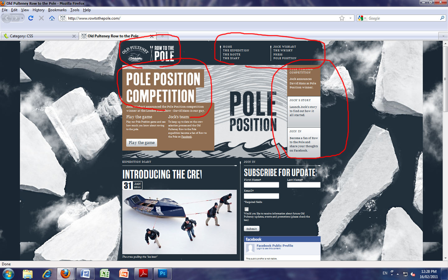
(image: Row to the Pole, Old Pulteney home page, http://www.rowtothepole.com/, Jock Wishart's, Date accessed: 25/02/2011)
As one can see this site passes the Trunk Test on the first 5 requirements but fails on the 6th. This site did not have an easily accessible (if it had one at all) search bar.
The second site was chosen for a clear use of high quality images, the focus here is very strong and effectivly gets the message across for the product. I was also interested in the fact that being such a popular company and site, Nike does not need its site ID to be anything more then it's logo. This shows this is a true icon.
It does not however pass the test.

(image: Nike snowboarding, Nikesnowboarding home page, www.nikesnowboarding.com/, Nike Jume 23 2009, Date accessed: 25/02/2011)
This site fails to employ the use of a search bar or a "You are here" navigator.
This site fails to employ the use of a search bar or a "You are here" navigator.
The third and final site for this blog update was a very visually appealing one. Employing a very unique and interesting layout, full of bright colour and text.

(image: DogsCanFly, DogsCanFly home page, http://www.dogscanfly.com/, Dogs Can Fly 2010, Date accessed: 25/02/2011)
Out of the three, this is was by far the easiest fail of the Trunk Test. It had a page name, different sections and subsections and links to supporting sites. There was little else on this site and the navigation is confusing at best. It does, however, remain to be a very inspirational design as well as an example of what not to do.
Out of the three, this is was by far the easiest fail of the Trunk Test. It had a page name, different sections and subsections and links to supporting sites. There was little else on this site and the navigation is confusing at best. It does, however, remain to be a very inspirational design as well as an example of what not to do.
Having done a bit of reasearch I am a little clearer on the direction I want to head in with my own design. Though not decided, I have observed alot of very good designs and taken little bits of knowledge and ideals from each.
Monday, February 7, 2011
Welcome to the blog...
If you are reading this, you have stumbled across my blog.
Christopher Peacock here, just saying welcome to the blog! Enjoy looking over the discussions and feeding my fish. Dont' forget to check the video bar of inspiration, some great stuff there!
Christopher Peacock here, just saying welcome to the blog! Enjoy looking over the discussions and feeding my fish. Dont' forget to check the video bar of inspiration, some great stuff there!
Subscribe to:
Posts (Atom)