Research and Trunk Test
Going through a bunch of different websites I picked three that I found interesting that weren't too ridiculous to use in the Trunk Test.
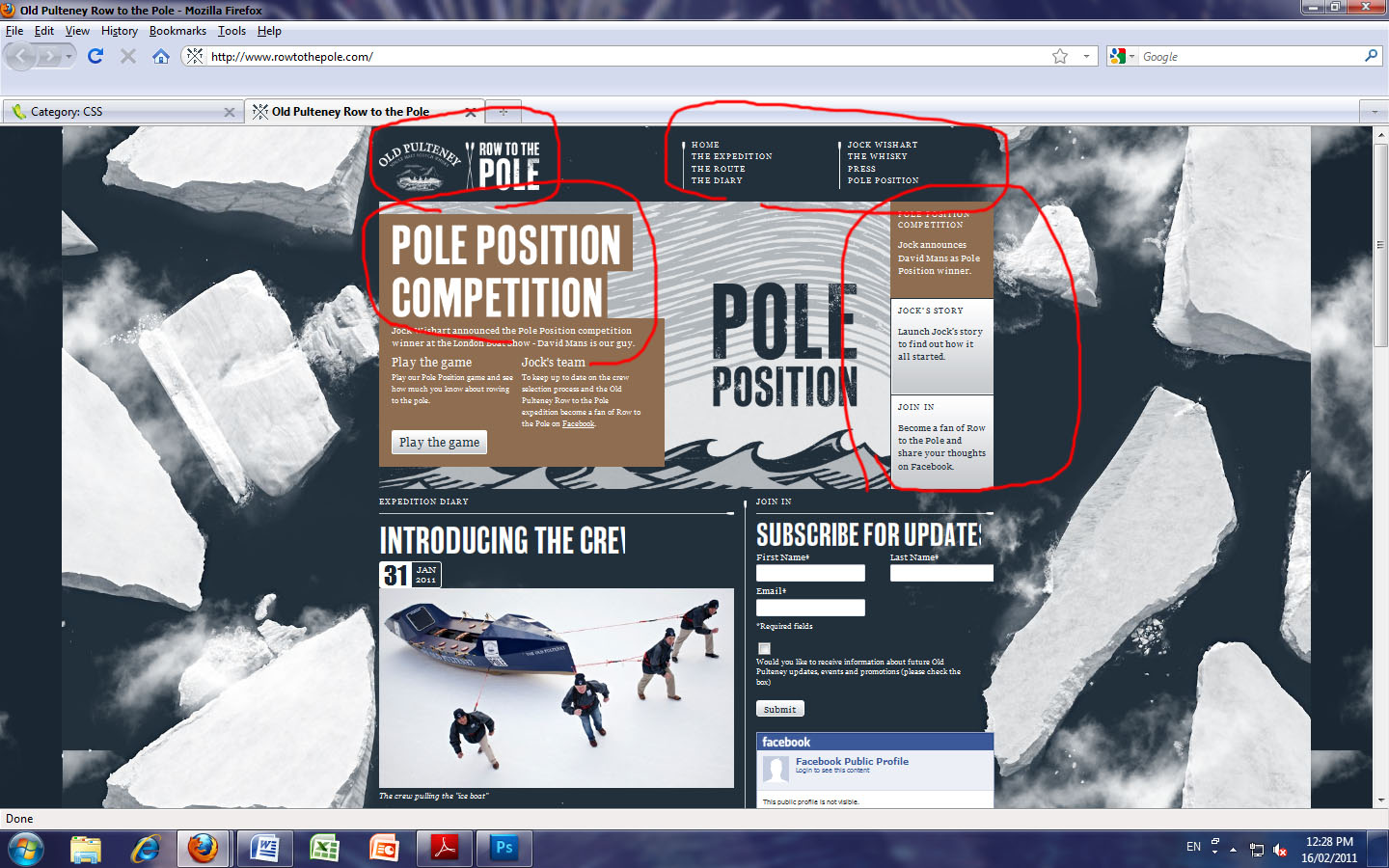
The first design I picked was one I chose because I liked the use of the background along with the simple use of relating images as backdrops for different sub sections of the site.
 (image: Row to the Pole, Old Pulteney home page, http://www.rowtothepole.com/, Jock Wishart's, Date accessed: 25/02/2011)
As one can see this site passes the Trunk Test on the first 5 requirements but fails on the 6th. This site did not have an easily accessible (if it had one at all) search bar.
The second site was chosen for a clear use of high quality images, the focus here is very strong and effectivly gets the message across for the product. I was also interested in the fact that being such a popular company and site, Nike does not need its site ID to be anything more then it's logo. This shows this is a true icon.
It does not however pass the test.
(image: Nike snowboarding, Nikesnowboarding home page, www.nikesnowboarding.com/, Nike Jume 23 2009, Date accessed: 25/02/2011)
This site fails to employ the use of a search bar or a "You are here" navigator.
The third and final site for this blog update was a very visually appealing one. Employing a very unique and interesting layout, full of bright colour and text.
(image: DogsCanFly, DogsCanFly home page, http://www.dogscanfly.com/, Dogs Can Fly 2010, Date accessed: 25/02/2011)
Out of the three, this is was by far the easiest fail of the Trunk Test. It had a page name, different sections and subsections and links to supporting sites. There was little else on this site and the navigation is confusing at best. It does, however, remain to be a very inspirational design as well as an example of what not to do.
Having done a bit of reasearch I am a little clearer on the direction I want to head in with my own design. Though not decided, I have observed alot of very good designs and taken little bits of knowledge and ideals from each.